widgets

Disabling a QLabel with links

Submitted by mimec on 2013-09-16

Qt doesn't have an equivalent of .NET's LinkLabel control, because the regular QLabel supports HTML content, including links. It's easy to create a link label using an anchor tag (i.e. <a href="...">...</a>). You can then handle the linkActivated signal or simply set the openExternalLinks property to true if you want the label to automatically open the link target in a web browser. However, there is one small limitation of the standard label widget: when you disable it, the links no longer work, but they are still drawn the same way as regular links (i.e. as blue underlined text).

Recently I had to slighty modify the notification schedule editor in WebIssues which looks like this:

Enabled labels

The links on the right make it easier to check or uncheck all options at once. However, the entire schedule needs to be disabled if sending summary emails is turned off:

Disabled labels

Note that the links are drawn in the same way as the regular disabled label and the checkboxes. How to achieve such effect?

After some research it turned out that tweaking the label's palette and/or style sheet doesn't do the job as expected. The workaround is to include the appropriate style directly in the anchor tag, for example:

QColor color = palette().color( QPalette::Disabled, QPalette::WindowText );
label->setText( QString( "<a href=\"%1\" style=\"color: %2; text-decoration: none;\">%3</a>" )
    .arg( linkUrl, color.name(), linkCaption );

Note that the disabled text color from the current palette is passed to the style definition so that it looks the same as the regular disabled label.

To make it easier, I wrote a very simple subclass of QLabel which automatically generates the correct HTML when it becomes enabled or disabled:

class LinkLabel : public QLabel
{
    Q_OBJECT
public:
    LinkLabel( const QString& caption, QWidget* parent ) : QLabel( parent ),
        m_linkUrl( "#" ),
        m_linkCaption( caption )
    {
        setTextFormat( Qt::RichText );
        updateLink();
    }

    ~LinkLabel() { }

public:
    void setLinkUrl( const QString& url )
    {
        m_linkUrl = url;
        updateLink();
    }

    const QString& linkUrl() const { return m_linkUrl; }

    void setLinkCaption( const QString& caption )
    {
        m_linkCaption = caption;
        updateLink();
    }

    const QString& linkCaption() const { return m_linkCaption; }

protected: // overrides
    void changeEvent( QEvent* e )
    {
        QLabel::changeEvent( e );
        if ( e->type() == QEvent::EnabledChange || e->type() == QEvent::PaletteChange )
            updateLink();
    }

private:
    void updateLink()
    {
        QString style;
        if ( !isEnabled() ) {
            QColor color = palette().color( QPalette::Disabled, QPalette::WindowText );
            style = QString( " style=\"color: %1; text-decoration: none;\"" ).arg( color.name() );
        }
        setText( QString( "<a href=\"%1\"%2>%3</a>" ).arg( Qt::escape( m_linkUrl ), style,
            Qt::escape( m_linkCaption ) ) );
    }

private:
    QString m_linkUrl;
    QString m_linkCaption;
};

Note that in this example the link's URL defaults to "#", which is convenient if the link is handled internally using the linkActivated signal. Of course you can overload the contstructor so that it takes the URL as a parameter. Also it's not very difficult to modify the code so that a single label could contain multiple links.

Tooltips for truncated items in a QTreeView

Submitted by mimec on 2012-04-23

It is quite common in various applications to display tooltips for truncated items in list views and tree views. Such functionality was present in Qt 3, but in Qt 4 the application, or rather the model, is fully responsible for providing the tooltip using the Qt::ToolTipRole and such automatic behavior no longer exist. You can obviously return the same text for both Qt::DisplayRole and Qt::ToolTipRole, but then tooltips are shown for all items, whether they are truncated or not. It doesn't look very well.

It's surprisingly hard to find a solution. The best I could find was this thread on the qt-interest mailing list. It suggests subclassing the view and overriding the tooltip event. I felt that there must be a better way, so I looked into the source code of QAbstractItemView. It turned out that since Qt 4.3, handling tooltips (and various other help events) is delegated to... the item delegate.

The definition of a custom item delegate may look like this:

class AutoToolTipDelegate : public QStyledItemDelegate
{
    Q_OBJECT
public:
    AutoToolTipDelegate( QObject* parent );
    ~AutoToolTipDelegate();

public slots:
    bool helpEvent( QHelpEvent* e, QAbstractItemView* view, const QStyleOptionViewItem& option,
        const QModelIndex& index );
};

Notice that the helpEvent method is a slot. It should be a virtual method; however adding a new virtual method to an existing class would break binary compatibility with earlier versions of the Qt library, so instead this method is invoked dynamically using the slots mechanism.

In order to check if the given item is truncated or not, we simply have to compare its visual rectangle (which can be retrieved from the view) with the size hint (provided by the item delegate itself). The full code of the helpEvent method looks like this:

bool AutoToolTipDelegate::helpEvent( QHelpEvent* e, QAbstractItemView* view,
    const QStyleOptionViewItem& option, const QModelIndex& index )
{
    if ( !e || !view )
        return false;

    if ( e->type() == QEvent::ToolTip ) {
        QRect rect = view->visualRect( index );
        QSize size = sizeHint( option, index );
        if ( rect.width() < size.width() ) {
            QVariant tooltip = index.data( Qt::DisplayRole );
            if ( tooltip.canConvert<QString>() ) {
                QToolTip::showText( e->globalPos(), QString( "<div>%1</div>" )
                    .arg( Qt::escape( tooltip.toString() ) ), view );
                return true;
            }
        }
        if ( !QStyledItemDelegate::helpEvent( e, view, option, index ) )
            QToolTip::hideText();
        return true;
    }

    return QStyledItemDelegate::helpEvent( e, view, option, index );
}

If the item is truncated, the display text is retrieved and displayed as a tooltip. Otherwise the default handler is called, so a custom tooltip may be displayed. If you want, you may reverse this behavior and only display the automatic tooltip if there is no custom one, or remove the call to the default handler if there are no custom tooltips.

Also notice that the text is wrapped into a <div> tag. That's in case the text is really long. When a HTML text is passed to the tooltip, it will be automatically wrapped into multiple lines if necessary. Otherwise the entire text would be displayed as a single line which may not fit on the screen. The Qt::escape method replaces any special characters with HTML entities to ensure that the text is displayed correctly.

All we have to do to enable automatic tooltips for a view is to assign our delegate to it:

view->setItemDelegate( new AutoToolTipDelegate( view ) );

Note that it will also work for other kinds of views, not only QTreeView.

Status bar and elided label

Submitted by mimec on 2011-11-13

Many applications use a QStatusBar to display various information at the bottom of the window. The good thing about this widget is that it can contain various other widgets, not only labels, but also buttons, progress bars, etc. But in the most common case the status bar simply contains a few labels, and lays them out in a horizontal bar layout.

Everything is fine when the information displayed in the status bar is short and the window is large enough. However one thing that we should remember about the QLabel is that it can be expanded as necessary, but in the default configuration it cannot shrink — unless it has word wrapping or auto-scaling (in case of graphic content) enabled, its preferred size is also the minimum size. The result is that the window must be at least as wide as the total widths of all status labels, and the user cannot make it smaller. But in some cases the status text can be arbitrarily long — take a web browser which displays the URL of the hovered link in the status bar, and we cannot make any assumptions about the maximum length of the link.

Qt has a powerful mechanism of layouts which offers various solutions to this problem. One solution is to set the horizontal size policy of the label to Ignored. In that case both the preferred size and the minimum size is ignored. That's fine when the status bar contains only a single label. But in many cases, there are several additional labels on the right, that should only take as much space as they need, but should also shrink when there is not enough space. The solution is to keep the Preferred size policy, but also force the label to have zero minimum width by using setMinimumWidth. (Edited on 2012-03-23: actually it must be a small value greater than zero; setting minimum width to zero has no effect.)

There is still a minor issue — when the QLabel shrinks, it doesn't elide the text (by appending ... to indicate that the text was truncated), but simply clips it. The QLabel can be extended to support elided text quite easily, and there are many ways to do that. When I first did that, based on some code that I found, it worked nicely, until I placed a few such labels side by side in a status bar. I couldn't get the layout to behave correctly, and finally I found that this problem was related to the mechanism of eliding text.

So in case you need to put together an elided label on your own: do this by simply overriding the paintEvent, and do not try to mess with setText or resizeEvent, because that may break the automatically calculated preferred size of the label. Here's a code snippet:

void ElidedLabel::paintEvent( QPaintEvent* /*e*/ )
{
    QPainter painter( this );
    drawFrame( &painter );

    QRect cr = contentsRect();
    cr.adjust( margin(), margin(), -margin(), -margin() );

    QString fullText = text();

    if ( fullText != m_lastText || cr.width() != m_lastWidth ) {
        m_elidedText = fontMetrics().elidedText( fullText, Qt::ElideRight,
            cr.width() );
        m_lastText = fullText;
        m_lastWidth = cr.width();
    }

    QStyleOption opt;
    opt.initFrom( this );

    style()->drawItemText( &painter, cr, alignment(), opt.palette, isEnabled(),
        m_elidedText, foregroundRole() );
}

Note that this code caches the elided text for better performance, using the m_elidedText, m_lastText and m_lastWidth member variables. Also note that it always uses Qt::ElideRight — you can customize this if you need. Of course this will only work in case of a single-line, plain text with no special formatting.

QComboBox with separator

Submitted by mimec on 2011-09-26

I haven't written for quite some time mostly because I'm getting more and more busy with WebIssues. Take a look at the online demo of the latest version, 1.0-beta2. But here's another post in my Qt series.

In version 4.4 of Qt a long awaited feature was added to the QComboBox widget. It is now possible to create separator items, which are drawn as thin, gray lines and cannot be selected. Before 4.4 it was necessary to create a custom item delegate, and also to add a few hacks in order to correctly calculate the height of the popup list and to make it impossible to select the separator using up and down arrow keys. Now we can simply use the insertSeparator method.

Perhaps it's a matter of taste, but I don't like that default separator. It has no space above and below and it is basically hardly visible. However we can change the way it looks by simply implementing a custom QItemDelegate and replacing the default delegate using setItemDelegate.

If you look at the source code of the combo box, or actually the internal QComboBoxDelegate class, you will see that a separator item has the Qt::AccessibleDescriptionRole data set to the string "separator". We can take advantage of this and increase the height of the separator to 5 pixels:

QSize sizeHint( const QStyleOptionViewItem& option, const QModelIndex& index ) const
{
    QString type = index.data( Qt::AccessibleDescriptionRole ).toString();
    if ( type == QLatin1String( "separator" ) )
        return QSize( 5, 5 );
    return QItemDelegate::sizeHint( option, index );
}

We can also override the paint method in order to draw a dark, horizontal line:

void paint( QPainter* painter, const QStyleOptionViewItem& option,
    const QModelIndex& index ) const
{
    QString type = index.data( Qt::AccessibleDescriptionRole ).toString();
    if ( type == QLatin1String( "separator" ) ) {
        QItemDelegate::paint( painter, option, index );
        int y = ( option.rect.top() + option.rect.bottom() ) / 2;
        painter->setPen(  option.palette.color( QPalette::Active, QPalette::Dark ) );
        painter->drawLine( option.rect.left(), y, option.rect.right(), y );
    } else {
        QItemDelegate::paint( painter, option, index );
    }
}

It's convenient to create a custom class which inherits QComboBox and automatically creates the custom delegate in the constructor. Then we can also add the missing, but very useful addSeparator method:

void addSeparator()
{
    insertSeparator( count() );
}

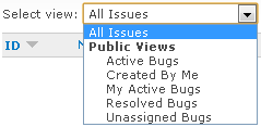
The custom delegate allows us to do much more interesting things. A nice feature of the <select> element in HTML is the ability to create groups of items. Parent items are displayed using bold font and are cannot be selected. Child items, on the other hand, are slightly indented. Here's an example:

Combobox with separator

It's easy to do something like this using a regular QComboBox in Qt. Assuming that the combo box uses the standard model, we can add the following helper method to add a "parent" item of a group:

void addParentItem( const QString& text )
{
    QStandardItem* item = new QStandardItem( text );
    item->setFlags( item->flags() & ~( Qt::ItemIsEnabled | Qt::ItemIsSelectable ) );
    item->setData( "parent", Qt::AccessibleDescriptionRole );

    QFont font = item->font();
    font.setBold( true );
    item->setFont( font );

    QStandardItemModel* itemModel = (QStandardItemModel*)model();
    itemModel->appendRow( item );
}

We make the item disabled and non-selectable in the same way as Qt does in case of separators. We also indicate that it's a parent item using the accessible description data. Finally we make the item's default font bold. The code for adding child items is even simpler:

void SeparatorComboBox::addChildItem( const QString& text, const QVariant& data )
{
    QStandardItem* item = new QStandardItem( text + QString( 4, QChar( ' ' ) ) );
    item->setData( data, Qt::UserRole );
    item->setData( "child", Qt::AccessibleDescriptionRole );

    QStandardItemModel* itemModel = (QStandardItemModel*)model();
    itemModel->appendRow( item );
}

We append 4 spaces to the item's text so that it's size is adjusted, while making the item still selectable by typing a few first letters. We also set the user data (for compatibility with addItem) and indicate that it's a child item. Now we have to slightly customize the way those special types of items are painted by the delegate:

if ( type == QLatin1String( "parent" ) ) {
    QStyleOptionViewItem parentOption = option;
    parentOption.state |= QStyle::State_Enabled;
    QItemDelegate::paint( painter, parentOption, index );
} else if ( type == QLatin1String( "child" ) ) {
    QStyleOptionViewItem childOption = option;
    int indent = option.fontMetrics.width( QString( 4, QChar( ' ' ) ) );
    childOption.rect.adjust( indent, 0, 0, 0 );
    childOption.textElideMode = Qt::ElideNone;
    QItemDelegate::paint( painter, childOption, index );
}

We paint the parent item as if it was enabled, otherwise it would be grayed. We also adjust the rectangle of the child item by the width of four spaces to make the indent.

Note that the width of "text " may sometimes be slightly smaller than the sum of widths of " " and "text" because of font kerning. The longest item may sometimes appear truncated (with "..." at the end). To prevent this, we disable the elide mode.

QSqlQueryModel and QTreeView - part 3

Submitted by mimec on 2011-07-06

In the previous post I started describing the SqlTreeModel which combines multiple QSqlQueryModels so that they can be used in a QTreeView.

We already know how to map items from multiple SQL models in order to create a hierarchy of items, how to map rows and columns from the SqlTreeModel into the SQL models, and how to implement the five pure virtual methods of QAbstractItemModel.

Our tree model already works, but items cannot be sorted by clicking on the column header. There are several ways to do that. One could use the QSqlTableModel which has built-in sorting support, but I find it easier to use the more generic QSqlQueryModel as it is more flexible and allows writing SQL queries by hand. Although it doesn't support sorting directly, the query can be modified so that it includes different ORDER BY clauses to achieve the same effect.

QAbstractItemModel has a virtual method called sort, which is called by the view when the user clicks on a column header. The default implementation does nothing, so we should provide a custom implementation in our derived class, SqlTreeModel. We should determine the order clauses based on the passed sort column index and order, pass new queries to QAbstractItemModels and rebuild the tree.

In fact, since QSqlTableModel is generic and can be reused by multiple different models with different queries, the sort only remembers the sort column and order and calls another virtual method, updateQueries, which is implemented by actual models. Individual models can extend this mechanism, and call this method, for example, when some filtering criteria are changed.

Some columns may be irrelevant for specific levels of items. For example, in WebIssues, the projects tree has two columns, Name and Type, but Type is only relevant for folders, and not for projects or alerts. When sorting by Type, the queries for projects and alerts are not modified, so the previous sorting order is retained at these levels, which produces logical and predictable results.

The last problem is that when the tree is rebuilt (for example, after changing the sort order), the view should be updated, but we don't wan't the current selection or expanded state of nodes to be lost, so we shouldn't simply call reset (which is what the standard SQL models do). Instead we should use the layoutAboutToBeChanged and layoutChanged signals.

The first signal indicates that the view should prepare for changes in the model. The second signal indicates that the changes are completed and the view should update itself. We also have to retrieve persistent indexes just after signalling layoutAboutToBeChanged and update these indexes to reflect changes in the model just before signalling layoutChanged.

How to map old indexes to new indexes? While updating the model, some rows may be added, some may be deleted, and some may be reordered. However, the identifiers (i.e. primary keys) of existing items will not change. So we should first map old indexes to levels and identifiers of corresponding items. After updating the tree, we should map levels and identifiers back to new indexes. To do that, we need a function which will find the index of the item with specified identifier at the specified level, but with the internal structures used to index the tree, it's an easy task. Such function is also useful, for example, if we wan't to select an item with given identifier.

The complete SqlTreeModel class is part of version 1.0 of the WebIssues client and it's available under the terms of the GNU General Public License. You can also use it, along with this series of posts, as a starting point for creating a custom model that goes beyond the standard functionality provided by the Qt framework.