I haven't written for quite some time mostly because I'm getting more and more busy with WebIssues. Take a look at the online demo of the latest version, 1.0-beta2. But here's another post in my Qt series.
In version 4.4 of Qt a long awaited feature was added to the QComboBox widget. It is now possible to create separator items, which are drawn as thin, gray lines and cannot be selected. Before 4.4 it was necessary to create a custom item delegate, and also to add a few hacks in order to correctly calculate the height of the popup list and to make it impossible to select the separator using up and down arrow keys. Now we can simply use the insertSeparator method.
Perhaps it's a matter of taste, but I don't like that default separator. It has no space above and below and it is basically hardly visible. However we can change the way it looks by simply implementing a custom QItemDelegate and replacing the default delegate using setItemDelegate.
If you look at the source code of the combo box, or actually the internal QComboBoxDelegate class, you will see that a separator item has the Qt::AccessibleDescriptionRole data set to the string "separator". We can take advantage of this and increase the height of the separator to 5 pixels:
QSize sizeHint( const QStyleOptionViewItem& option, const QModelIndex& index ) const
{
    QString type = index.data( Qt::AccessibleDescriptionRole ).toString();
    if ( type == QLatin1String( "separator" ) )
        return QSize( 5, 5 );
    return QItemDelegate::sizeHint( option, index );
}
We can also override the paint method in order to draw a dark, horizontal line:
void paint( QPainter* painter, const QStyleOptionViewItem& option,
    const QModelIndex& index ) const
{
    QString type = index.data( Qt::AccessibleDescriptionRole ).toString();
    if ( type == QLatin1String( "separator" ) ) {
        QItemDelegate::paint( painter, option, index );
        int y = ( option.rect.top() + option.rect.bottom() ) / 2;
        painter->setPen(  option.palette.color( QPalette::Active, QPalette::Dark ) );
        painter->drawLine( option.rect.left(), y, option.rect.right(), y );
    } else {
        QItemDelegate::paint( painter, option, index );
    }
}
It's convenient to create a custom class which inherits QComboBox and automatically creates the custom delegate in the constructor. Then we can also add the missing, but very useful addSeparator method:
void addSeparator()
{
    insertSeparator( count() );
}
The custom delegate allows us to do much more interesting things. A nice feature of the <select> element in HTML is the ability to create groups of items. Parent items are displayed using bold font and are cannot be selected. Child items, on the other hand, are slightly indented. Here's an example:
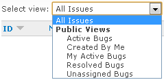
It's easy to do something like this using a regular QComboBox in Qt. Assuming that the combo box uses the standard model, we can add the following helper method to add a "parent" item of a group:
void addParentItem( const QString& text )
{
    QStandardItem* item = new QStandardItem( text );
    item->setFlags( item->flags() & ~( Qt::ItemIsEnabled | Qt::ItemIsSelectable ) );
    item->setData( "parent", Qt::AccessibleDescriptionRole );

    QFont font = item->font();
    font.setBold( true );
    item->setFont( font );

    QStandardItemModel* itemModel = (QStandardItemModel*)model();
    itemModel->appendRow( item );
}
We make the item disabled and non-selectable in the same way as Qt does in case of separators. We also indicate that it's a parent item using the accessible description data. Finally we make the item's default font bold. The code for adding child items is even simpler:
void SeparatorComboBox::addChildItem( const QString& text, const QVariant& data )
{
    QStandardItem* item = new QStandardItem( text + QString( 4, QChar( ' ' ) ) );
    item->setData( data, Qt::UserRole );
    item->setData( "child", Qt::AccessibleDescriptionRole );

    QStandardItemModel* itemModel = (QStandardItemModel*)model();
    itemModel->appendRow( item );
}
We append 4 spaces to the item's text so that it's size is adjusted, while making the item still selectable by typing a few first letters. We also set the user data (for compatibility with addItem) and indicate that it's a child item. Now we have to slightly customize the way those special types of items are painted by the delegate:
if ( type == QLatin1String( "parent" ) ) {
    QStyleOptionViewItem parentOption = option;
    parentOption.state |= QStyle::State_Enabled;
    QItemDelegate::paint( painter, parentOption, index );
} else if ( type == QLatin1String( "child" ) ) {
    QStyleOptionViewItem childOption = option;
    int indent = option.fontMetrics.width( QString( 4, QChar( ' ' ) ) );
    childOption.rect.adjust( indent, 0, 0, 0 );
    childOption.textElideMode = Qt::ElideNone;
    QItemDelegate::paint( painter, childOption, index );
}
We paint the parent item as if it was enabled, otherwise it would be grayed. We also adjust the rectangle of the child item by the width of four spaces to make the indent.
Note that the width of "text " may sometimes be slightly smaller than the sum of widths of " " and "text" because of font kerning. The longest item may sometimes appear truncated (with "..." at the end). To prevent this, we disable the elide mode.
- Log in to post comments